CSS 3 典型概念与布局详解
层叠样式表(CSS,Cascading
Stylesheet)用于指定 Web 浏览器的渲染样式,CSS 2.1
规范于 2011 年发布之后日益变得丰富与庞大,因此 W3C
工作组将规范分散至不同模块,每个模块都独立的进行版本更新。其中,全部
CSS 2.1 特性模块都被升级至 3
作为版本号,而全新的功能模块则从版本号 1 开始进行定义。因而
CSS 3 并非实际意义上的 W3C
规范,准确的描述应该为 CSS 标准规范第 3
版与部分新规范第 1 版的集合。
伴随 Web 浏览器技术的日新月异,现代 CSS 开发的重点,已经不在于处理浏览器碎片化引发的各类兼容性问题,而是在确保代码可维护性前提下,符合 Web 页面的语义标准,从而尽可能准确的表达各类交互创意。在阅读 W3C 工作组成员 Lea Verou 的《CSS Mastery》之后,开始重新审视前端重度交互下 CSS 提供的各类全新特性,结合 Mozilla 社区的 《CSS Reference》 一文,重新讨论 CSS 技术相关的一些主题。
层叠优先级
浏览器通过层叠样式表的优先级判断哪些 CSS 属性值与 HTML 元素相关,当 HTML 元素同时拥有多个 CSS 声明时,每条高优先级的 CSS 规则都会覆盖低优先级规则。
CSS 层叠样式表的优先级是一种权重,当多个 CSS 优先级权重相同时,声明位置最后的那个声明将会被应用。
声明位置的优先级
按照样式声明与定义位置的不同,优先级由高向低排列如下:
- 行内样式:
<span style=""> - 内嵌样式:
<style></style> - 外部样式:
<link href="demo.css" rel="stylesheet" />
选择器类型的优先级
按照所使用CSS 选择器的不同,优先级由高向低排列如下:
- ID 选择器(
#example) - 类选择器(
.example),属性选择器([type="radio"]),伪类选择器(:hover) - 类型选择器(
h1)和 伪元素选择器(::before)
1 | <p id="p" class="p">Color is blue!</p> |
通用选择器(
*)、组合选择器(+, >, ~, ' ')*
:not 伪类的优先级
否定伪类选择器:not()本身对优先级没有影响,但是:not()内部声明的选择器会影响到层叠的优先级。
1 | <div class="outer"> |
!important 优先级
两条相互冲突的!important规则被应用到相同 HTML
元素时,拥有更大优先级的声明将会被采用。!important会破坏
CSS 固有的级联规则,为调试和 debug
带来困难,因此应尽量考虑使用样式规则的优先级去解决问题,通过更好的利用
CSS
级联属性,或者使用更加具体的选择器,去获得更高的优先级。
1 | <article> |
如果需要覆盖
!important,可以再添加一条优先级更高的!important即可。
更加详细选择器的优先级
CSS 选择器越详细,其对应的优先级就越高。
1 | <div id="demo"> |
基于选择器形式的优先级
优先级总是基于选择器的类型进行计算的,下面代码尽管*[id="demo"]选择了ID,但是依然会作为属性选择器去计算自身的优先级。
1 | #demo { |
忽略 CSS 选择器在 DOM 当中的实际距离
实际 DOM 中的距离或深度,并不计入 CSS 层叠样式权重的考量。
1 | <html> |
直接的目标元素样式与从父元素继承的样式。
直接向目标元素添加的样式,其优先级总是高于从父元素继承的样式。
1 | <html> |
样式继承
每个 CSS 属性值都会指明其是否可以继承,以便在没有手动为 HTML 元素指定样式值时,该元素默认应该使用哪个样式。
- 可继承 CSS 属性(inherited property):未指定值时,取父元素同属性的计算值(computed value)。
- 非继承 CSS 属性(reset property):未指定值时,取该属性的初始值(initial value)。
所有 CSS 属性都可以使用如下 2 个值:
inherit:让该 CSS 元素值去继承父元素同名 CSS 属性的计算值。initial:将被父元素覆盖的属性值重置为该 CSS 属性的默认值。
!important
使用!important规则的样式声明将会覆盖其它任何声明,如果两条带有!important规则的声明被应用到相同
HTML 元素上,拥有更高优先级的声明将会被采用。
1 | background: red ; |
不要在全站、插件当中使用
!important,尽量只在局部页面需要覆写的情况下使用。
盒子模型
每个 HTML 元素都会被 CSS
描述为一个矩形的盒子,每个盒子模型都由content内容、padding内边距、border边框、margin外边距4
个框所组成。
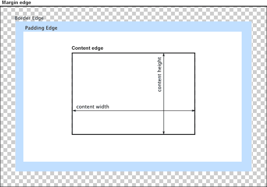
content内容区域设置的背景、颜色、图片样式会延伸到padding区域。
可替换 HTML 元素
HTML 可替换元素(replaced element)的渲染并不由CSS控制,某些情况下,CSS 会对可替换元素做特殊处理,比如计算外边距和一些 auto 值。
1 | <!-- 典型可替换元素 --> |
通过 CSS 的
content属性插入的 HTML 内容,被称为匿名可替换元素(anonymous replaced elements)。
简写属性
CSS 规范定义简写属性的目的,在于将同一主题的常见属性定义集中在一起,从而编写更简洁、更具可读性的样式表。
1 | /* background */ |
目前 CSS 可以进行简写的属性如下:
flexlist-styletransitiontransform,backgroundfontmarginpaddingborderborder-topborder-rightborder-bottomborder-leftborder-widthborder-colorborder-styleborder-radius
块级/行内元素
块级元素(block-level)
当 HTML
元素的display属性为block、list-item、table时,该元素就是块级元素。块级元素视觉上呈现为竖直排列的块,<div>和<p>都是典型的块级元素。
行内元素(inline-level)
当 HTML
元素的display属性为inline、inline-block、inline-table时,该元素为行内元素。视觉上行内元素的内容会逐行进行排列,文本和图片都是典型的行内级元素。
定位
CSS 为开发人员提供了 3 种布局方式:标准文档流、定位布局、浮动布局。盒子模型生成之后,浏览器渲染引擎会通过如下属性定位其在文档中的位置。
position 属性
static元素遵循常规文档流,指定元素使用正常的布局行为,即元素在文档常规流中当前的布局位置。此时top、right、bottom、left和z-index属性无效。换而言之,只有当position属性值为非static时,层叠顺序才可以通过z-index属性定义。relative元素遵循常规文档流,参照自身在常规流中的位置,通过 4 个偏移属性top、right、bottom、left进行定位,但并不会影响常规流中的其它元素。当该元素的z-index不为auto时,这种定位方式会创建一个新的层叠上下文。fixed元素脱离常规文档流,与absolute属性值类似,但元素的包含块为viewport,常用于设置滚动屏幕时仍固定在相同位置的元素。当该元素的z-index不为auto时,此种定位方式依然会创建一个新的层叠上下文。absolute元素脱离常规文档流,所以不会为元素预留空间,元素位置将会参照最近的非 static 定位祖先元素,如果该祖先元素不存在,则相对于根级容器进行定位。元素的偏移位置不影响常规流中的其它元素,其margin不会与其它边距产生折叠。当该元素的z-index不为auto时,该种定位方式同样会创建一个新的层叠上下文。- 绝对定位元素的
top、right、bottom、left属性未设置时,会紧随在前面的兄弟元素之后,虽然位置上不影响常规流中其它元素,但是该元素会失去其位置并与后继元素发生折叠。 - 如果同时指定绝对定位元素的
top和bottom将会优先采用top;如果同时指定left和right,则优先采用left。 - 当绝对定位元素的
height和width属性值为auto时,会自动计算并填充父元素的宽度。 - 当同时指定绝对定位元素的
top和bottom时,如果height的值为auto,则会填充父元素的垂直空间。 - 当同时指定绝对定位元素的
left和right时,如果width的值为auto,则会填充父元素的水平空间。
- 绝对定位元素的
float 属性
元素脱离正常的文档流,但是相对于绝对定位,浮动定位依然保留着部分的流式特性。HTML 元素设置浮动之后,将会被移出正常的文档流,然后向左或向右平移,直到碰到所处的容器边框或碰到另一个浮动元素。
发生浮动后的元素允许文本、内联元素环绕在其旁边,这也是认为其保留部分流式特性的原因所在。
发生浮动定位时,元素 CSS 属性的
position必须为static或relative。使用
float之后会让元素的display属性体现为块元素。none:指定的 HTML 元素将不进行浮动。left:指定的 HTML 元素将浮动在其所在块容器左侧。right:指定的 HTML 元素将浮动在其所在块容器右侧。
float属性在position: absolute和display: none时不会生效。
clear 属性
设置当前 HTML 元素左右侧是否需要清除浮动,需要被清除的浮动是指之前出现在相同块级格式化上下文中的浮动。
none:两侧都可以存在浮动元素。left:不允许左侧出现浮动元素。right:不允许右侧出现浮动元素。both:两侧都不允许出现浮动元素。
1 | <div class="test1">1</div> |
1 | .test1 { float: left; } |
1 | .test1 { float: left; } |
1 | .test1 { float: left; } |
- 应用于浮动元素时,会将浮动元素的
margin移动至所有相关浮动元素margin的下方,这样会影响后面浮动元素的布局,后面的浮动元素的位置无法高于前面的元素。 - 应用于非浮动元素时,会将非浮动元素的
border移动至所有相关浮动元素margin的下方,该行为会导致margin collapsing失效。
1 | <div class="test1">1</div> |
1 | .test1 { |

1 | .test1 { |

外边距塌陷
margin 塌陷(margin collapsing)是指 HTML 块元素的顶部 margin 和底部 margin 有时会被折叠为 margin 值最大的外边距,外边距塌陷通常发生在下面 3 种情况:
- 相邻的两个兄弟 HTML 元素之间的 margin 会塌陷。
1 | <!-- 两个p元素的margin发生塌陷,渲染出p元素的间隔为30px --> |
- 块级父元素与其第 1 个/最后 1 个子元素
如果块级的父 HTML
元素未使用border-top、padding-top、inline、
clear属性(即border-top、padding-top为
0 的时候),此时父元素与第 1
个子元素会发生上外边距合并,展现出的外边距将是两者之间margin-top最大的那个。
1 | <section style="margin-top: 30px;"> |
如果块级父元素未使用border、padding、inline、height、min-height、max-height属性,则父元素与最后
1 个子元素将发生下外边距合并。
1 | <section style="margin-bottom: 15px;"> |
- 空的块元素
如果一个没有内容的空块级元素未使用border、padding、inline、height、min-height属性,此时它将会与相临的兄弟元素发生上下外边距合并。
1 | <!-- 中间div元素的与相邻p元素首先发生margin塌陷,然后两个p元素的margin再次发生塌陷,最终只渲染出间隔30px的两个p元素 --> |
当存在一个负值margin时,塌陷后的外边距是两者之和;如果margin都为负值,则取绝对值最大的那个。
1 | <!-- 两个div元素发生外边距塌陷,渲染出的div元素间隔距离是20px --> |
即使外边距为 0,这些规则也仍旧生效。
包含块
HTML 元素的尺寸、位置经常受到其包含块(containing
block)的影响,通常情况下包含块是其父元素,但特殊情况下并不总是这样,因此必须通过
HTML 元素的position属性来确定其包含块。
如果
position属性是static或relative,包含块就是其父级块元素(例如inline-block、block、list-item)或格式化上下文(例如 table 容器、flex 容器、grid 容器、block 容器本身)内容区的边缘组成。如果
position属性是absolute,包含块就是由距离最近的position属性值非static(fixed,absolute,relative,sticky)的祖先元素的内边距区的边缘组成。如果
position属性是fixed,包含块由viewport或页面区域所组成。如果
position属性是absolute或fixed,包含块也有可能是由满足下面条件的最近父元素的内边距区的边缘组成:
- 一个非 none 的转换或透视值。
- 一个将会改变的转换或透视值。
- 一个非 none 的过滤值,或者一个将会改变的过滤值(仅工作在 Firefox)。
根元素
<html>所在的包含块是一个被称为初始包含块的矩形区域。
CSS 属性被赋予一个百分比值的时候,其值由该元素的包含块计算而来的。
- 一个 HTML
元素的
height、top、bottom属性值由包含块的height属性值计算而来(*如果包含块的height值依赖于其内容,且包含块的position属性值为relative或static,则该 HTML 元素的这些值为0*)。 - 一个 HTML
元素的
width、left、right、padding、margin属性由包含块的width属性值来计算而来。
接下来的各个例子中的 CSS 样式都统一使用如下 HTML:
1 | <body> |
下面例子中,因为<p>元素处于静态位置,其临近的祖先
HTML
元素<section>是一个块元素,所以其包含块就是<section>,

1 | body { |
下面例子中,HTML
元素<p>的包含块是<body>,因为<section>不是块元素且没有建立格式化上下文。

1 | body { |
下面例子中,元素<p>的包含块是<section>,这是因为<section>的position属性为absolute,<p>的百分比属性值受到包含块<section>的padding值影响,

1 | body { |
下面例子中,元素<p>的position属性为fixed,因此其包含块为初始化包含块(屏幕上的
viewport)。因此<p>元素的尺寸会受到浏览器 window
尺寸的影响。

1 | body { |
下面例子中,元素<p>的position属性为absolute,因此其包含块为<section>,因为<section>作为临近祖先元素,并且使用了非none的transform属性。

1 | body { |
重绘与回流
讨论本小节内容之前,首先了解一下浏览器对于 HTML 和 CSS 的渲染流程:
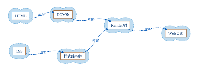
- 浏览器将获取到的 HTML 代码解析为一颗DOM 树,每个
HTML 标签都是 DOM 树的一个节点,根节点是 document 对象。DOM
树包含页面所有 HTML 标签,包括被
display:none隐藏以及 JavaScript 动态添加的元素。 - 浏览器将所有 CSS
样式解析成为一个样式结构体,并去掉浏览器不能识别的样式(_例如
IE 会去掉
-moz开头的样式,而 Firefox 会去掉_开头的样式_)。 - DOM 树与样式结构体会组合构建成为一颗Render 树,
不同于 DOM 树,Render
树能够识别样式,树上的每个节点都有拥有自己的样式,并且不会包含隐藏的节点(例如被
display:none的节点和<head>节点),因为这些节点不会用于呈现。但是被visibility:hidden隐藏的元素还是会包含至 Render 树,因为它会占据空间并影响到页面的布局。 - 当 Render 树构建完毕之后,浏览器就可以根据它进行页面的绘制了。
CSS 2.1 标准当中,Render 树上的每个节点被称为Box,即一个具有内外边距、填充、边框、位置的盒子模型。
当页面元素的外观或者可见性发生改变的时候(outline、visibility、background、color)会发生重绘;当变化涉及到部分或整个页面的布局的时候会发生回流,浏览器在发生回流的时候会使
Render
树中受影响的部分失效,并重新构造这部分渲染树,完成回流后再重绘该部分到屏幕;重绘(repaint)与回流(reflow)都会对
HTML 页面的渲染性能造成影响。
因为,回流必然引起重绘,而重绘并不一定引起回流;所以,解决渲染性能的问题,需要需要明确回流可能会发生的场景:
- 调整窗口大小;
- 改变文字字体;
- 增加或移除样式表;
- 内容发生变化,比如用户在
input框中输入文字; - 激活 CSS 伪类,比如
:hover(在 IE 当中是兄弟结点伪类被激活的时候); - 操作
class属性; - JavaScript 脚本操作 DOM;
- 计算
offsetWidth和offsetHeight属性; - 设置
style属性的值;
针对上面回流所发生的场景,接下来讨论如何将回流对页面渲染性能的影响降到最低。
- 最好是通过改变
class属性来设置元素样式,并尽可能直接改变目标 DOM 节点的class属性,从而限制回流范围,减少可能影响到的 DOM 节点。 - 避免在 HTML 元素上面设置多层的内联样式,同样也是一种控制回流范围的有效手段,
- 如果动画效果应用到
position属性为absolute或fixed的元素上,并不会影响其它 HTML 元素的布局,不会造成全部回流。 - 适当牺牲动画效果的平滑度,去换取更好的 CPU 动画渲染速度。
- 避免使用
table布局,否则可能会因为个别行、列的变化而引发整张表格的回流。 - 减少 JavaScript 表达式当中对 CSS 的操作次数,避免引发重复的回流操作。
缩上所述,尽量缩小回流操作的作用范围,并且尽量降低回流操作的运行次数,是降低回流对页面渲染性能影响的主要思路。
主流的 Web 浏览器都会对回流和重绘进行一定的优化,浏览器自身会维护一个队列,并将所有引起回流、重绘的操作放入该队列,等待这些操作积累到一定数量或者经过了一定时间间隔,浏览器就会自动刷新队列并执行一个批处理操作,这样就将多次的回流与重绘变成一次操作。
但是一些获取 HTML 元素样式信息的 JavaScript
方法(offsetTop/Left/Width/Height、scrollTop/Left/Width/Height、clientTop/Left/Width/Height、width/height、getComputedStyle()或者currentStyle),由于需要得到当前具体的样式信息,可能会让浏览器强制刷新当前的渲染队列。
因此,减少一些页面样式信息的获取,尽量利用好浏览器的优化策略,也是一种较为重要的优化思路。
一列布局
1 | <main id="app"> |
一列定宽布局

1 | #app { |
一列宽度自适应

1 | <main id="app"> |
1 | #app { |
一列宽度居中

1 | <main id="app"> |
1 | #app { |
二列布局
1 | <main id="app"> |
二列定宽布局

1 | #app { |
二列宽度自适应

1 | #app { |
二列右侧宽度自适应

1 | #app { |
二列左侧宽度自适应
1 | #app { |
负外边距和不设置宽度和浮动都可以用来分别实现二列左右侧宽度自适应效果。
三列布局
三列中间自适应布局

1 | <main id="app"> |
1 | #app { |
三列左侧自适应布局
1 | <main id="app"> |
1 | #app { |
三列右侧自适应布局
1 | <main id="app"> |
1 | #app { |
圣杯布局
双飞翼布局
垂直居中
最早实现垂直居中的技术是通过组合使用position的absolute和relative属性进行偏移和修正,该方式会产生冗余
HTML 标签从而影响页面的语义化,所以笔者并不推荐使用。
1 | <div class="parent"> |
1 | $width: 500px; // 居中元素的宽度 |

如果知道居中 HTML
元素的width和height尺寸,且不希望使用冗余标签影响页面语义化,可以考虑通过margin
负值方便的实现垂直居中。

1 | <body> |
1 | <style> |

当不知道居中 HTML 元素的具体尺寸的时候,可以通过表格定位实现居中效果。
1 | <table> |
1 | table { |
如果需要让 HTML
结构更加语义化,可以通过display的table和table-cell属性将上面例子修改成下面这样:
1 | <div class="parent"> |
1 | .parent { |

table 的渲染与传统块级元素的渲染略有不同,table 只能扩张到内部嵌套内容的宽度,而块级元素则可以自动扩张到其父级元素的宽度。
CSS2.1 当中最终极和完美的居中技术是通过影子 HTML
元素,如果设置其到
100%高度的父元素当中,然后分别设置vertical-align: middle。影子元素并不会影响页面的语义化,因为可以将其设置为一个伪元素(**)。
1 | <div class="parent"> |
1 | .parent { |

text-align属性用来定义行内内容(例如文字)如何相对其块级父元素对齐,该
CSS
属性并不控制块级元素自身的对齐,只控制块级元素内部的行内内容的对齐方式。
left:行内内容向左侧对齐。right:行内内容向右侧对齐。center:行内内容居中。justify:行内内容向两端对齐。start:行内内容对齐开始边界,如果文字方向是left-to-right,作用与left属性值相同;如果文字方向是right-to-left,作用与right属性值相同。end:行内内容对齐结束边界,如果文字方向是left-to-right,作用与right属性值相同;如果文字方向是right-to-left,作用与left属性值相同。

margin 负值
line-height
text-align
vertical-align
溢出与换行
响应式栅格
CSS 精灵
box-sizing
CSS 中设置 HTML
元素的width与height只会作用在该元素的内容区,盒子模型的宽高会叠加border、padding的值,因此调整宽高度的时候需要时刻注意该
HTML
元素的border、padding,该特性在实现响应式布局时显得相当烦琐,而box-sizing属性正是用来调整这一行为的。
1 | .block { |

content-box:默认值,宽度和高度都不包含内容的border和padding。
1 | width = "内容的宽度"; |
border-box:盒子模型的宽、高度都会包含border和padding。
1 | width = "border + padding + 内容区width"; |
flex
本段内容翻译自CSS Tricks社区的《A Complete Guide to Flexbox》一文,Flex 在最近的最近的 W3C 草案称为Flexbox Layout(笔者文章中统一翻译为伸缩盒布局),主要用于更有效的排列、布局、分配 container 中 items 之间的空间,即使是在这些元素尺寸未知或者动态的时候。Flex 伸缩布局的主要思想,是让 container 具体改变其中 items 宽度、高度、顺序的能力,从而更优雅的填充可利用空间,并在它们缩小时防止 overflow 发生。


Flex 非常适用于组件级别、小粒度的页面布局,更大粒度的布局可以考虑使用 Grid。
container 的属性
display
定义一个 flex container,可以设置行内或者块级元素,设置之后其直接子元素将会纳入 flex 上下文。
1 | .container { |
flex-direction
定义 items 在 container 中的排列方向,可以是垂直或者水平的方向。

1 | .container { |
row (默认): 在ltr环境下从左到右,rtl当中从右至左进行排列。row-reverse: 在ltr环境下从右到左,rtl当中从左至右进行排列。column: 作用与row属性值类似,但是方向为从上至下。column-reverse: 作用与row-reverse属性值类似,但是方向为从下至上。
flex-wrap
默认情况下,items 总是会试图填充一行,但是可以通过这个属性去调整这一行为,让 items 根据需要进行换行。

1 | .container { |
nowrap (默认): 所有 items 将会位于同一行当中。
wrap: items
将会从上至下进行换行。
wrap-reverse: items
将会从下至上进行换行。
flex-flow
该属性是flex-direction和flex-wrap的简写,用来定义
container 的main axes和cross
axes,其默认值为row nowrap。
1 | flex-flow: <‘flex-direction’> || <‘flex-wrap’>; |
justify-content
英文 justify 有对齐的意思,即沿着 main axis 进行对齐。主要用于 items 不能伸缩时,分配空余的 container 空间;或是 items 能够伸缩,但是已经达到最大尺寸的场景。因此,该属性会在一行中的 items 发生溢出时影响其在 container 中的对齐方式。
1 | .container { |

flex-start (默认): items 被放置到每行开始的位置。
flex-end: items 会被放置到每行结束的位置。
center: items 会在该行居中放置。
space-between: items 规则分布在一行当中,第 1 个 item
位于行的开始位置,最后 1 个 item
位于行结束的位置。 space-around: 所有
items 两侧都拥有相同的间距,因此视觉上的间距并不相等。第 1 个 item
将会依靠 container 边缘保持1 个单元的距离,但接下来的
item 两侧都拥有着自己的空间,这样会导致出现2
个单元的间距。 space-evenly: 所以
items平均分布在一行,每个 item
的间隔距离视觉上完全相等。
align-items
该属性用于定义当前行中的 items 如何基于cross
axis进行布局,功能与main
axis上的justify-content属性类似。
1 | .container { |

stretch (默认):
填充父容器,stretch [stretʃ] n.伸展(仍然需要考虑到min-width/max-width)。
flex-start: items 的起始位置位于该行 cross axis
的顶部。 flex-end: items
的起始位置位于该行 cross axis 的底部。
center: items 位于该行 cross axis
的居中位置。 baseline: items
基于它们基线的位置进行排列。
align-content
该属性用于设置当 cross-axis 拥有额外空间时,如何去排列 container
的行。类似于justify-content在 main axis
内如何排列每个单独的 items 行,因此当仅存在一个 items
行的时候,该属性并不会体现任何效果。
1 | .container { |

stretch (默认): container
中的行伸缩并且占据剩余的空间。 flex-start:
container 中的行放置在容器起始的位置。
flex-end: container
中的行放置在容器结束的位置。 center:
容器里的行在 container 中处于居中位置。
space-between: 第 1 行位于 container 起始的位置,最后 1
行位于 container
最后的位置,接下来中间的行进行平均分布。
space-around:
每行都以相同的间隔距离均匀分布。
items 的属性
order
items 默认按照 HTML 源代码的先后顺序排列,但是可以通过 items
的order属性来控制其在 container 中的顺序。

1 | .item { |
flex-grow
用来定义 items 在 container
中弹性伸展的比例,其属性值为没有单位的比例值,从而规定每个
item 所应该占据的空间。如果所有 item
的flex-grow设置为1,那么每个 item
将会均匀的占据 container 中剩余的空间。如果其中某个 item
的flex-grow设置为2,则将会占据其它 item
两倍的空间。

1 | .item { |
flex-grow的属性值不能是负数,否则将会被认为是一个无效值。
flex-shrink
该属性用来设置
item弹性收缩时的比例,属性值依然为没有单位的比例值(shrink [ʃrɪŋk] n.收缩)。
1 | .item { |
flex-shrink的属性值同样不能为负数,否则会被认为无效。
flex-basis
设置不伸缩的情况下 items 的原始默认尺寸,其属性值可以是长度值或者关键字。
length:单位数值,例如20%、5rem、px、mm、pt。auto:基于 items 自身的高度和宽度属性。content:根据 items 的内容自动调整大小尺寸,该主流浏览器对该关键字的支持还不太友好,因此包括类似的max-content,min-content,fit-content属性值较少被使用。
1 | .item { |
flex-basis属性值如果设置为0,items 内部内容以外的区域将不会被考虑。但如果设置为auto,剩余空间将基于flex-grow进行分配。

flex
该属性是flex-grow, flex-shrink,
flex-basis属性的简写,该属性值第 2
个参数(flex-shrink)、第 3
个参数(flex-basis)是可选的,默认值为0 1 auto。
1 | .item { |
推荐使用该简写属性来简化 items 的设置。
align-self
items 上的这个属性会覆写 container
上align-items属性的设置。
1 | .item { |

注意,item 上的
float,clear,vertical-align属性不会对 flex 布局造成影响。
Flex 布局思维导图

transition
CSS3 中提供的 transition 特性,提供了 CSS 属性变化时控制动画速度的方式,代替了 CSS 属性发生变化时立刻进行渲染的特性。transition 能够决定哪个 CSS 属性体现过渡效果(transition-property),过渡效果何时开始发生(transition-delay),过渡期会持续多久(transition-duration),过渡效果将会如何体现(transition-timing-function)。transition 属性结合 CSS 伪类选择器进行使用,可以实现非常良好的用户体验。
transition-property
指定需要应用过渡效果的 CSS 属性的名称。
all:所有能使用过渡的 CSS 属性全部有效。none:没有 CSS 属性会产生过渡效果。- 可以使用过渡的 CSS 属性:指定需要产生过渡效果的 CSS 属性。
1 | transition-property: none; |
transition-duration
指定过渡动画持续的秒数或者毫秒数,默认值为0s,表明不会发生过渡效果。该属性可以同时指定多个持续时间值,这些时间会依次应用到transition-property上声明的属性。
1 | transition-duration: 6s; |
transition-timing-function
描述 CSS
属性需要体现的过渡效果,通过建立一个加速曲线让过渡效果贯穿于transition-duration定义的持续时间,这些加速曲线使用timing-function进行定义。该属性同样可以一次指定多个
timing-function,这些效果会在transition-property上依次应用。
1 | /* Keyword values */ |
transition-delay
描述过渡效果的延迟等待时间,属性值为0s或0ms时表明过渡立即执行,为正值时会延迟过渡的执行时间,负值则会让过渡立刻开始(但是可能会从中间状态开始)。该属性依然可以指定多个延迟时间,这些时间会依次应用到transition-property上声明的属性。
1 | transition-delay: 3s; |
transition
该属性是transition-property,
transition-duration,
transition-timing-function,
transition-delay的简写属性,可以快捷的定义 HTML 元素 2
种状态之间的转换,并结合 CSS
伪类选择器(例如:hover和:active)共同定义交互的过渡状态,或使用
JavaScript 动态的进行设置。
1 | /* Order for complete property */ |
animation
CSS 动画由 2 部分组成,CSS 动画的样式描述,以及标识动画开始、结束以及中间状态的关键帧(keyframe)。CSS 动画比 JavaScript 控制的动画性能更加优异,浏览器执行更加平顺。
animation-delay
定义动画执行的延迟时间,单位是秒(s)或毫秒(ms),可以设置为未来的某个时间点(正值),或者立即开始执行(属性值为 0),或者从动画生命周期的中途执行(负值)。
1 | /* Single animation */ |
animation-direction
定义动画的播放方式,可以是向前、向后,或者前后交替播放。
normal:正常向前播放。reverse:反方向播放。alternate:先正常再反向播放,并持续交替执行。alternate-reverse:先反向再正常播放,并持续交替执行。
1 | /* Single animation */ |
animation-duration
定义完成一个动画周期所需要的时间,值可以为正数或零,单位是秒(m)或毫秒(ms)。默认值为零,表示没有动画发生。
1 | /* Single animation */ |
animation-fill-mode
设置目标 HTML 元素在动画周期之外所呈现的状态。
none:默认值,不设置动画之外的状态。forwards:设置为动画结束时的状态。backwards:设置为动画开始时的状态。both:遵循动画向前、向后的规则,设置为动画结束或开始的状态。
1 | /* Single animation */ |
animation-iteration-count
设置动画周期在结束之前所需要播放的次数,可以指定为多个值。
infinite:无限循环。<number>:动画周期的重复播放次数,默认值为1,设置为小数会只播放动画周期的一部分。
1 | animation-iteration-count: 3; |
animation-name
指定需要应用到 HTML
元素上的一个或多个动画名称,每个动画名称都会通过一个@keyframes规则进行定义。
none:表示不指定任何关键帧动画。<custom-ident>:指定关键帧动画的名称,对大小写敏感,可以由字母、数字、_或-组成。
1 | /* Single animation */ |
animation-play-state
用于指定动画的运行和停止,可以通过 JavaScript 设置该属性的值,进而实现对动画播放的控制。
running:播放动画。paused:暂停播放,恢复时会从暂停的位置开始,而非重新开始一个动画周期。
1 | /* Single animation */ |
animation-timing-function
动画的时序函数通过三次贝塞尔数学函数(Cubic Bezier)来生成速度曲线。
cubic-bezier(<number>, <number>, <number>, <number>):指定贝塞尔曲线类型,4 个参数都需要在[0, 1]区间范围内。linear:线性过渡,等同贝塞尔曲线(0.0, 0.0, 1.0, 1.0)。ease:平滑过渡,等同贝塞尔曲线(0.25, 0.1, 0.25, 1.0)。ease-in:由慢到快,等同贝塞尔曲线(0.42, 0, 1.0, 1.0)。ease-out:由快到慢,等同贝塞尔曲线(0, 0, 0.58, 1.0)。ease-in-out:由慢到快再到慢,等同贝塞尔曲线(0.42, 0, 0.58, 1.0)。steps(<integer>[, [ start | end ] ]?):接受 2 个参数的步进函数。第 1 个参数是指定函数步进数的正整数,第 2 个参数可选,用于指定每一步值发生变化的时间点,可以为start或end(默认值)关键字。step-start:等同于steps(1, start)。step-end:等同于steps(1, end)。
1 | /* Keyword values */ |
animation
动画的快捷属性,其默认值列表如下所示:
animation-name: noneanimation-duration: 0sanimation-timing-function: easeanimation-delay: 0sanimation-iteration-count: 1animation-direction: normalanimation-fill-mode: noneanimation-play-state: running
1 | /* @keyframes duration | timing-function | delay | iteration-count | direction | fill-mode | play-state | name */ |
@keyframes
通过为关键帧或者基准点定义样式,来控制动画序列的中间步骤,相比于transitions过渡,animation
能够提供更为丰富的设置。@keyframes定义的名称需要添加至animation-name属性上,每个@keyframes规则都包含了一组关键帧选择器的列表,这些选择器设置了动画周期上指定时间百分比的样式,即定义每一个关键帧所呈现的样式。
from:起始于动画序列时间0%的开始偏移量。
to:起始于动画序列时间100%的结束偏移量。
<percentage>:动画序列时间的具体百分比。
1 | @keyframes tofrom { |
@keyframes规则不会级联,浏览器总是执行最后定义的关键帧。
声明在关键帧中的
!important属性将会被忽略。
@media
transform
grid
注意:一直以来,浏览器都通过前缀来区分那些最新的、具有实验性质的 CSS3 属性,例如 Firefox 浏览器(
-moz-)、IE 浏览器-ms-)、Opera(-o-)、Safari 和 Chrome(-webkit-),但是这样并不利于规范的升级与统一,因此后续的新版浏览器正在逐步放弃这种做法,改为通过配置开关来启用这些实验性属性的支持。
CSS 3 典型概念与布局详解